We've moved!

TechKnack.blogspot.com has officially moved to TechKnack.net. You should be redirected in 3-5 seconds. Thank you.

April 28, 2008

Compiz: The Ultimate in Useless Eyecandy?

Add this post to Del.icio.us. Del.icio.us (0 saved)

That's right, it's time for a technologically controversial post. :)

Compiz is the ultimate in eyecandy. Seriously. With wobbly windows; various window-switching mechanisms such as shift-switcher, ring-swither, and regular tab-switcher; a multi-desktop cube; Mac Expose-style effects; some wicked screensavers; and a whole array of window opening, closing, minimizing, focus/unfocus, etc animations, it clearly outshines Vista and OS X combined. It's also pretty darn efficient - as I type this, Compiz is using no more than 12MB of memory, and I rarely reboot my machine. :D

However, as cool as it is, I find myself using very, very few of the available plugins in my daily workflow. With my current setup, I have all three window switchers; a four-desktop cube; wobbly windows; open/close "glide", minimize/unminimize "genie", and focus/unfocus "fade" animations; current-desktop and all-desktop Expose effect; show desktop; and the spinning cube screensaver enabled. Of all these functions, though, I only use the cube regularly. I have it setup so that Alt+Ctrl+Left/Right arrow spins the cube, and I use that for switching between desktops. For switching between windows? I use Avant Window Navigator. With an icon for each window, I just click on the one I need to go to. And, of course, the animations, screensaver, and wobbly windows are ever-present and fairly unobtrusive. I just find that the majority of the available effects aren't useful in my everyday workflow. I mean, fish inside my cube? Drawing on my screen with fire? Not only not useful, but a nonproductive use of resources. :)

I suppose the purpose of having so many effects, other than sheer amount of eyecandy, is choice. However, choice or not, a lot of the effects are just plain useless, such as the aforementioned Aquarium plugin.

What plugins do you use on a daily basis, if any? And which plugins do you have enabled that merely gather dust? :)

April 25, 2008

Hardy Heron Up For Download

Add this post to Del.icio.us. Del.icio.us (0 saved)

Ubuntu version Hardy Heron (8.04) was officially set loose yesterday. Existing users can upgrade (instructions available for Xubuntu, Kubuntu, and Ubuntu), download (X/K/U), or torrent (some on LinuxTracker, as well as the official Xubuntu, Kubuntu, and Ubuntu downloads [Xubuntu link was not working last I checked; for Kubuntu, select a mirror site like OSU Open Source Lab to find the torrents]).

Also available from the Kubuntu side is the Kubuntu-KDE4 remix.

Edit: Newly seeded by yours truly, Kubuntu 8.04 and Kubuntu 8.04 KDE4 remix ISOs. Both i386-desktop versions with MD5SUM files.

April 22, 2008

Character Maps for Linux

Add this post to Del.icio.us. Del.icio.us (0 saved)

Ever had to make use of special characters? For example, to put an equation like ∫x² dx in an OpenOffice document? How do you get at those characters, anyway?

In Windows, there's the Character Map, via Start Menu -> Accessories -> System Tools -> Character Map. For KDE users, check out kcharselect. Gnome users should look at gucharmap. I've not had experience with gucharmap, but kcharselect has a very good search feature, "categories", and a description of the selected character.

April 19, 2008

Alternative Link Underlining

Add this post to Del.icio.us. Del.icio.us (0 saved)

Ever seen the odd site that, instead of solid or absent underlining, has a dotted or dashed underline? Ever wonder how it's done? It's really simple: border-style.

All you need to do to get an alternative underlining effect is to, first off, hide the default underline with text-decoration:none, and then specify a bottom border for the affected links: a:link { text-decoration:none; border-bottom: black dashed 1px; } To make the effect stand out, you could also make the link and border separate colors, either on hover or all the time.

April 16, 2008

Easy Linux-to-Windows File Sharing

Add this post to Del.icio.us. Del.icio.us (0 saved)

Samba has long been the defacto standard for accessing Windows file shares from Linux. However, there is also a Samba daemon (background service) that, if configured correctly, plays the reverse role -- sharing Linux directories to Windows machines. Unfortunately, proper setup requires you to edit the /etc/samba/smb.conf file, which, like most configuration files, can be rather cryptic.

Enter the GUI solution: system-config-samba. That's the package name in the Ubuntu universe repositories, I don't think the program itself has a proper name other than "Samba" (also check out the Fedora project wiki for the app). It's a sparse little app that gives you GUI access to the settings of the smb.conf file. Once you get the behind-the-scenes details set, though, adding shared directories is a snap.

First make sure you have samba installed (package "samba" in Ubuntu repos). Next, install the samba config package - "sudo aptitude install system-config-samba". The installation should put an entry called "Samba" in your Ubuntu menu (for me, using Kubuntu, it's under "Settings"). If you can't find it there, you can start it from a command line by running "system-config-samba &". Before the program starts, it will ask for your administrative password (same as your sudo password, unless you've changed something around).

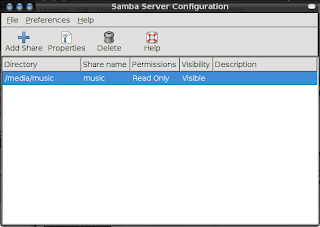
Once at the main window, You can begin to appreciate how simple SCS makes configuration, using three main buttons that are very self-explanatory, along with a simple list of currently shared directories.

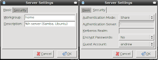
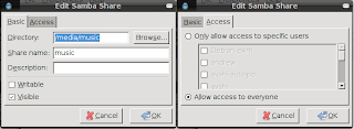
Before you start sharing, you'll want to setup the basic, general details. Open Preferences -> Server Settings. In the Basic tab, set your Workgroup (the default for Windows machines is usually "MSHOME" -- make sure all your computers use the same workgroup name, to avoid issues) and the computer description. In the Security tab, you set the sharing settings. For my home network, which sits behind a router, I use the "Share" authentication mode and set the guest account to my account, to allow open access to my shared directories. Once that's done, click OK. The program may seem to hang for a second or two - this is just the program restarting the Samba daemon for you, and happens everytime you change the settings for Samba or for a share. Next, setup a new share. I have a separate partition that contains all my music ripped from CDs. Within Kubuntu, I mount this partition as read-only, and remount it as read-write only when I need to modify the files (for example, add new rips or coverart). Here I'm sharing it to "everyone", read-only, under the name "music". Check out nixCraft for a quick rundown on Samba permissions.

If everything is right, you should now be able to access the Samba share from a Windows machine on the same network. I haven't tried this method for accessing the share from a Mac, but presumably you can use the same methods you would use for accessing a Windows share.

April 12, 2008

Pretty Up Your Forms with CSS

Add this post to Del.icio.us. Del.icio.us (0 saved)

Download Example

Let's face it: form elements au naturel are NOT pretty. So what do we do with them? We add a border thickness here, a border color there, leaving the whole thing largely unchanged. And still ugly. Time to change that.

I'm going to use the Tableless CSS Forms code provided by DynamicDrive's CSS library contributors. This gives us the basic layout and essential elements without too much trouble:

We'll start with the basics: borders and background. In Web 2.0, simplicity is king. Beveled corners? Sooo Web 1.0. Sooo not pretty. We'll make the borders solid, with uniform color, and thin to keep the simplicity. And we'll specify a white background to avoid any cross-browser issues: .cssform input, .cssform textarea { border:#999 solid 1px; background:#FFF; } A nice, neutral gray tones down the harshness of the input areas' borders, and the solid-1px all the way around eliminates any doubts as to where the areas begin and end.

Next we want to make it a li'l roomier. How do you like cramming text into zero-padding textboxes? .cssform input { padding:3px 5px; } .cssform textarea { padding:5px; } Here's when you start getting into trouble with the disparities in browsers' box models, though as long as the width of the elements isn't an issue, you should be fine.

Now that we've covered the foundation, time to break out the makeup: images! Using a very small, very subtle gradient image, we can add a simple inner shadow to each input field. While this is "adding features", I feel it actually adds to the feeling of simplicity: .cssform input, .cssform textarea { border:#999 solid 1px; background:#FFF url(formgrad.png) repeat-x top left; } The gradient image is a 1px wide by 15px high PNG image with a gradient of hex colors #EEEEEE (top) to #FFFFFF (bottom). The slightest difference in color makes for a very nice effect.

We could very well stop here -- all the form elements are styled nicely, even the submit and reset buttons. But why stop there when you can make the buttons intuitive as well? .cssform .submit { background:#FFF url(submitgrad.png) repeat-x bottom left; } .cssform .reset { background:#FFF url(resetgrad.png) repeat-x bottom left; } Here we use another technique found at DynamicDrive. This simply adds two other colored gradient images to the background of the appropriate buttons. Of course, you must add the appropriate classes to the buttons for this to work. If you want to take full advantage of CSS standards and leave IE6 and below behind in the dust, you could just use the attribute selector: .cssform input[type="submit"] { background:#FFF url(submitgrad.png) repeat-x bottom left; } .cssform input[type="reset"] { background:#FFF url(resetgrad.png) repeat-x bottom left; }

And there you have it. With no more than three images (or one, if you prefer), some very simple CSS, and an eye for simplicity, we've made our form elements nice looking.

Additional links:
Download the example
DynamicDrive: CSS Tableless Forms
DynamicDrive: Stylish Submit Buttons

April 9, 2008

Do we really need the br element?

Add this post to Del.icio.us. Del.icio.us (0 saved)

Do we really need the lowly <br/> element? Apparently the W3C thinks so, with HTML5 containing the element. I mean, seriously, what does it do that a span styled with display:block; can't?

The last two times I've seen it used were in articles about creating a tableless photo gallery and making a CSS block nav menu. In both instances, the br was used to drop down the descriptive text to the next line. In both instances, a span surrounding the descriptive text, and with its display set to block, does the exact same thing.

I suppose an argument could be made about users with CSS turned off. In my opinion, though, if you have CSS turned off, you're willing to deal with a few minor inconveniences. If you're that worried about them, throw in a space before the span for readability. And if you really insist on giving them the extra lines of text -- there's always the naturally-block-level <div>.

And what about screenreaders? I doubt they'd be affected either way (it is whitespace, after all -- right?), but I really have no clue. Perhaps someone who uses a screenreader could tell me, after chewing me out about my own blog's (actually Blogger's) screenreader-friendliness. :o

April 6, 2008

Put intrusive KDE4 apps in their place

Add this post to Del.icio.us. Del.icio.us (0 saved)

If you've installed KDE4 -- the whole shebang in one fell swoop with "sudo aptitude install kde4" (on Ubuntu) -- you'll have noticed that the environment insists that you use the new-and-improved "KDE4-ready" apps. These apps have package names like "kopete-kde4" and "ark-kde4". However, newer is not always better. Maybe the new version, using the new Qt4 widgets, doesn't have as "clean" an interface as the old version -- Konqueror a case in point, though more due to its changed interface than the use of Qt4. Or another small example: kopete (kde3 version) supports IRC chat, while kopete-kde4 seemingly does not. Yet whenever I type "kopete" at the command line or, more commonly, when it opens at startup, kopete-kde4 pops up. Either way, gimme my old app!

Turns out that part of the KDE4 install process adds a path to the beginning of your PATH variable, /usr/lib/kde4/bin. This is where all the "xxxxxx-kde4" apps reside, ready to spring to life when you type their name. Putting the KDE4 apps aside and bringing the older, more familiar versions to the forefront is a simple matter of renaming and symlinking.

For this example, we'll use Kopete. First, move the offending KDE4 version out of the way; execute the following command: $ sudo mv /usr/lib/kde4/bin/kopete /usr/lib/kde4/bin/kopete-kde4 This renames the program to "kopete-kde4", so you can still start the program if you need to. Next, we symlink (create a shortcut to) the "standard" kopete: $ sudo ln -s /usr/bin/kopete /usr/lib/kde4/bin/ This basically says "create a soft link to /usr/bin/kopete in the /usr/lib/kde4/bin directory". The resulting link file will also be named kopete, letting you call the KDE3 version normally.

While this method works well for smaller apps (Kopete, Konsole, etc), I haven't been able to trust it with more essential programs, such as KDM. KDM has been especially annoying; supposedly you can configure it to use the old KDM by running "sudo dpkg-reconfigure kdm" and choosing "kdm" from the menu, but this hasn't worked for me, and I've tried several times.

April 4, 2008

Promote Standards Awareness with CSS Naked

Add this post to Del.icio.us. Del.icio.us (0 saved)

CSS Naked is a standards-awareness initiative led/organized by Dustin Diaz. On the specified date, April 9th, all participating websites will strip their sites of their CSS, allowing the world to see the underlying clean-code usability:

The idea behind this event is to promote Web Standards. Plain and simple. This includes proper use of (x)html, semantic markup, a good hierarchy structure, and of course, a good 'ol play on words. It's time to show off your <body>.

While I would love to participate in this, I wouldn't recommend it for Blogger users. The building blocks of Blogger blogs, widgets, produce all sort of irrelevant divs and such that are used exclusively as CSS hooks. Aside from the fact that the underlying code is NOT semantic, disabling styles on Blogger sites (well, this one anyway) is NOT pretty (or, for that matter, usable). If you must see the results of such an inadvisable act as disabling CSS, you can (using FireFox) go to View -> Page Style -> No Style. This will disable styles for the current page (or the current tab, I'm not exactly sure).

So, to reverse Dustin's little play on words -- sorry, you don't get to see my <body> :P

April 1, 2008

Got Mad Coding Skills?

Add this post to Del.icio.us. Del.icio.us (0 saved)

Think you got what it takes to slice up a PSD file into a valid and usable (X)HTML template? Then check out CSS Off, a contest that gives you the opportunity to do just that. At one minute past midnight CST on April 5, a PSD file will be uploaded for contestants to download. Contestants will have up to 24 hours to submit their completed entry.

Don't have Photoshop? Check out the GIMP! I'm hoping that the PSD file is GIMP-compatible. You could try to convert it one way (using an online service) or another (directly in the GIMP),but there's always the issue of unsupported layer effects getting messed up.

And, no, this is not an AFD trick. At least, I hope it isn't...

IE8: In Like A Lion, Out Like A Lamb

Add this post to Del.icio.us. Del.icio.us (0 saved)

Here it is, the end of March, and I just couldn't help but notice how little has been said about IE8 lately. When the first beta was publicly released amidst the MIX08 madness, you could almost feel the blogosphere shuddering with the news. The tremors were discernible for what...a week? Maybe two? Then all became silent once more. Is it just that it's Microsoft, and everyone's tired themselves out with the extra efforts put toward M$-bashing that week? Or is it because everyone and their mother (and their dog, to top all) reviewed the thing like no tomorrow, and our eyes have grown weary of the Blue E? (if your eyes are, indeed, weary of the Blue E, don't click that link)

Whatever the reason, I just thought I'd note that the famous March proverb seemed to apply to IE8, with about the same timing. Perhaps we'll hear more about it (both bashing and praise) when it goes stable?